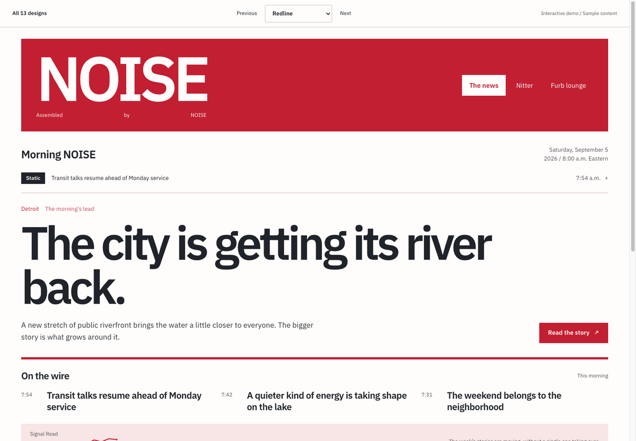
Redline
A red masthead and a front page with the scale of a street poster.
Ten new directions for the news, the timeline, and the collecting table. Choose a design, then switch products to see the system at work.
Different type, color, shape, and rhythm.
A red masthead and a front page with the scale of a street poster.
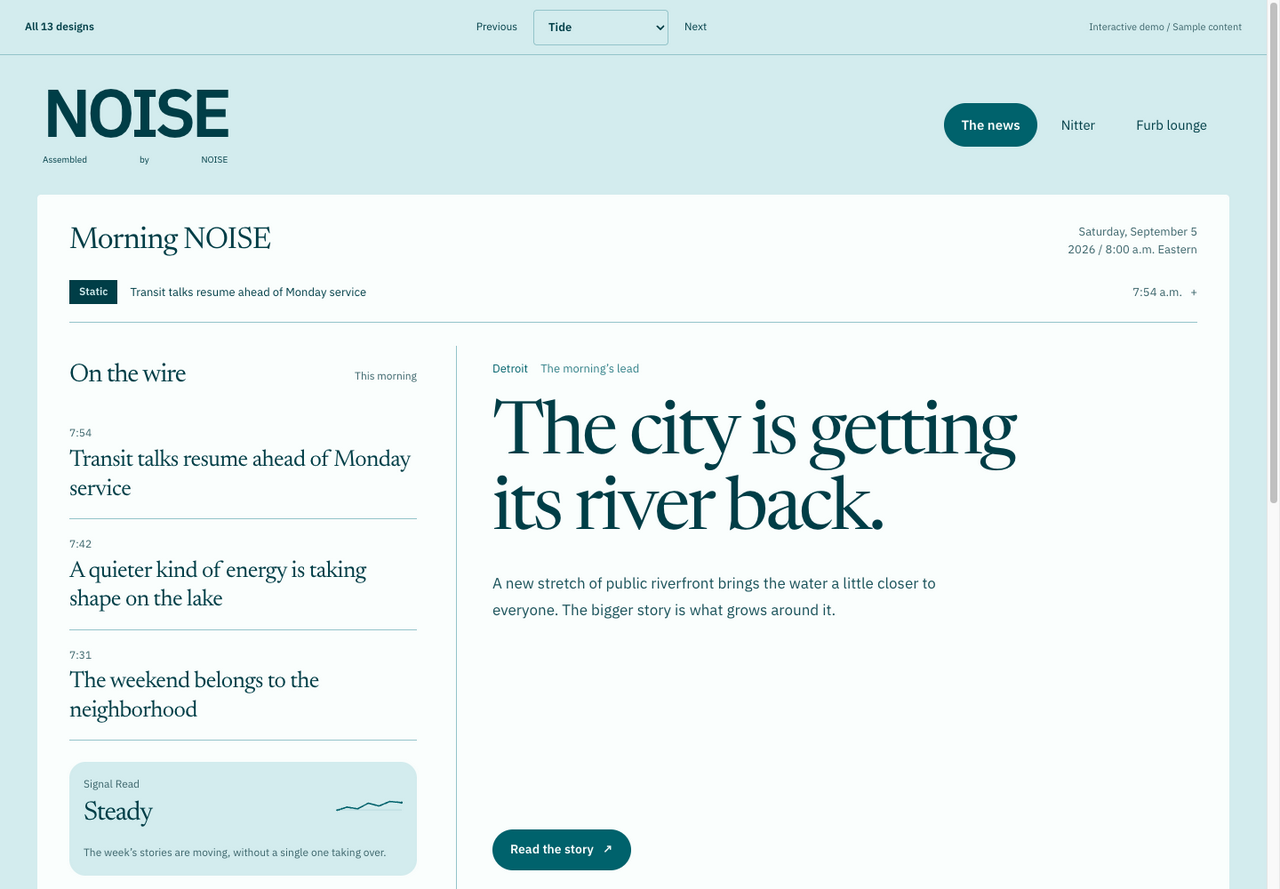
An open waterside reading room, with the wire desk along the left edge.
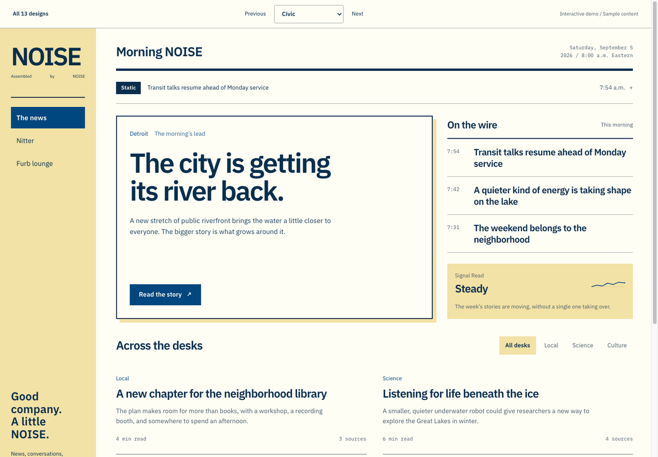
Municipal blue, noticeboard yellow, and unmistakable public-signage hierarchy.
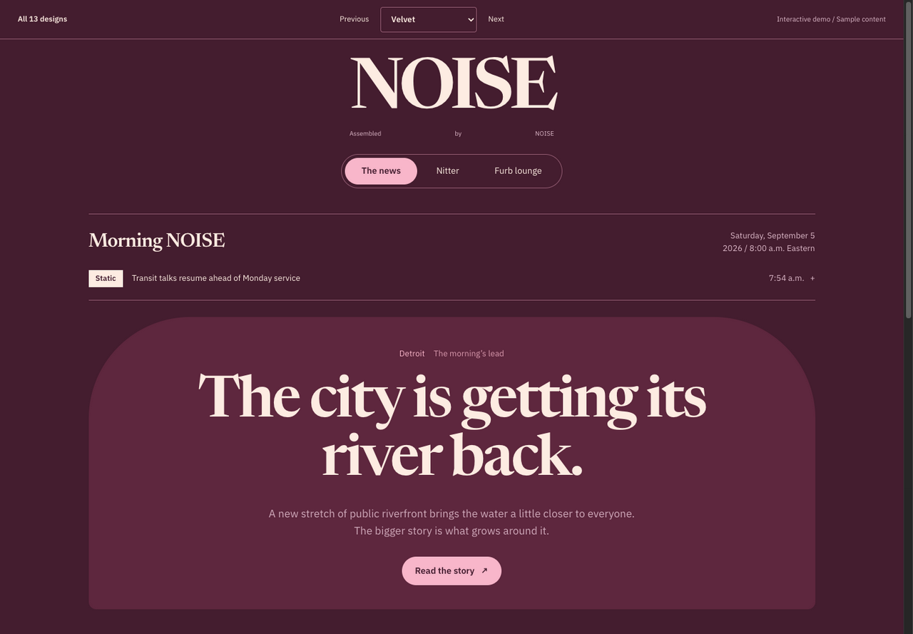
Wine-colored rooms, an arched front page, and a cream reading surface.
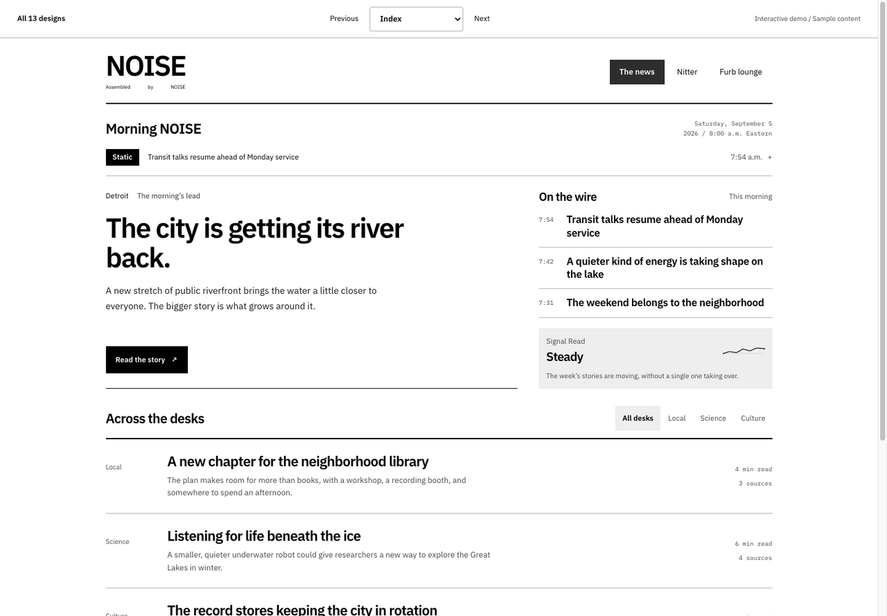
A compact black-and-white catalog built for people who read everything.
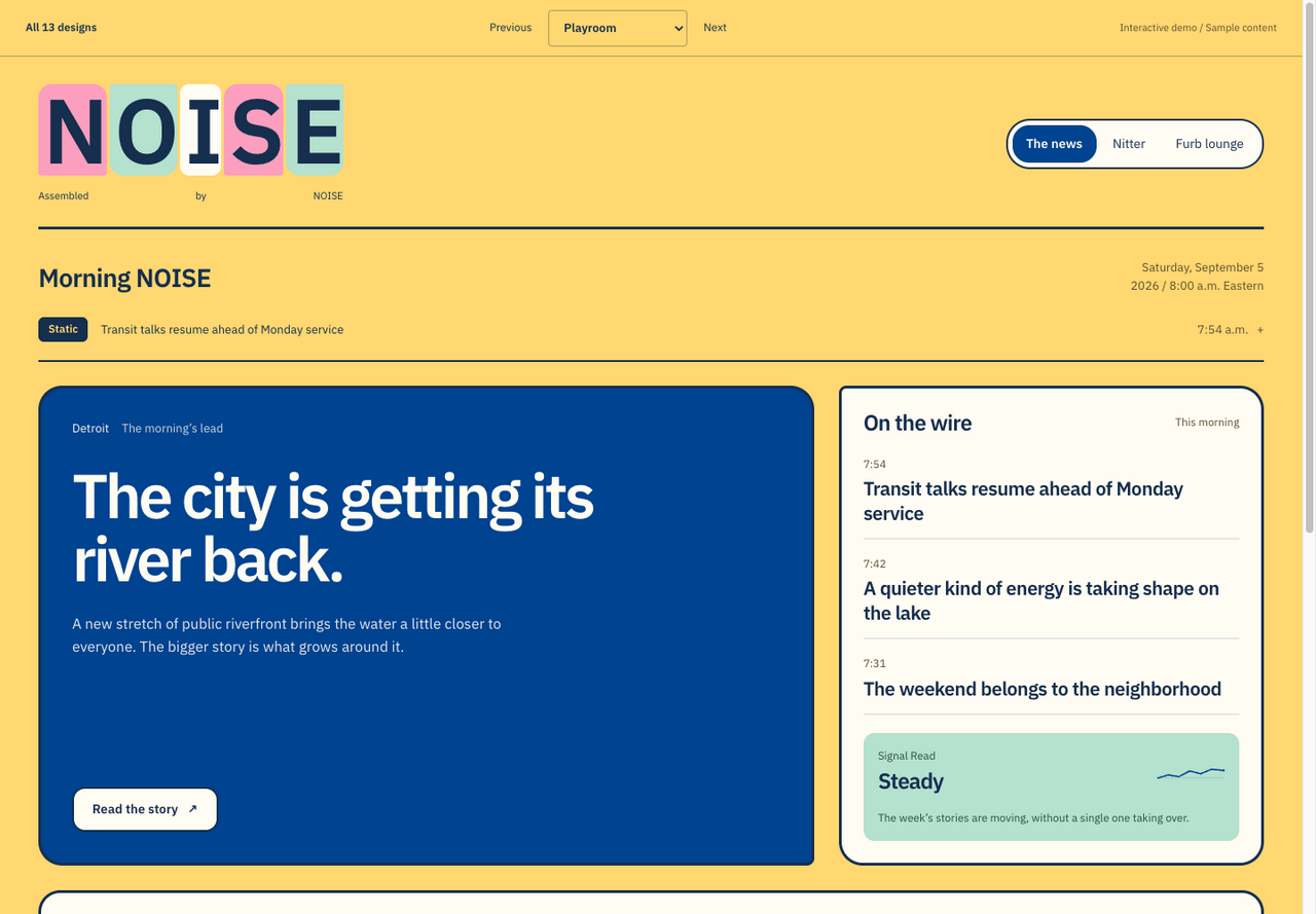
Toy-box lettering, bright packaging colors, and a proper home for Furbs.
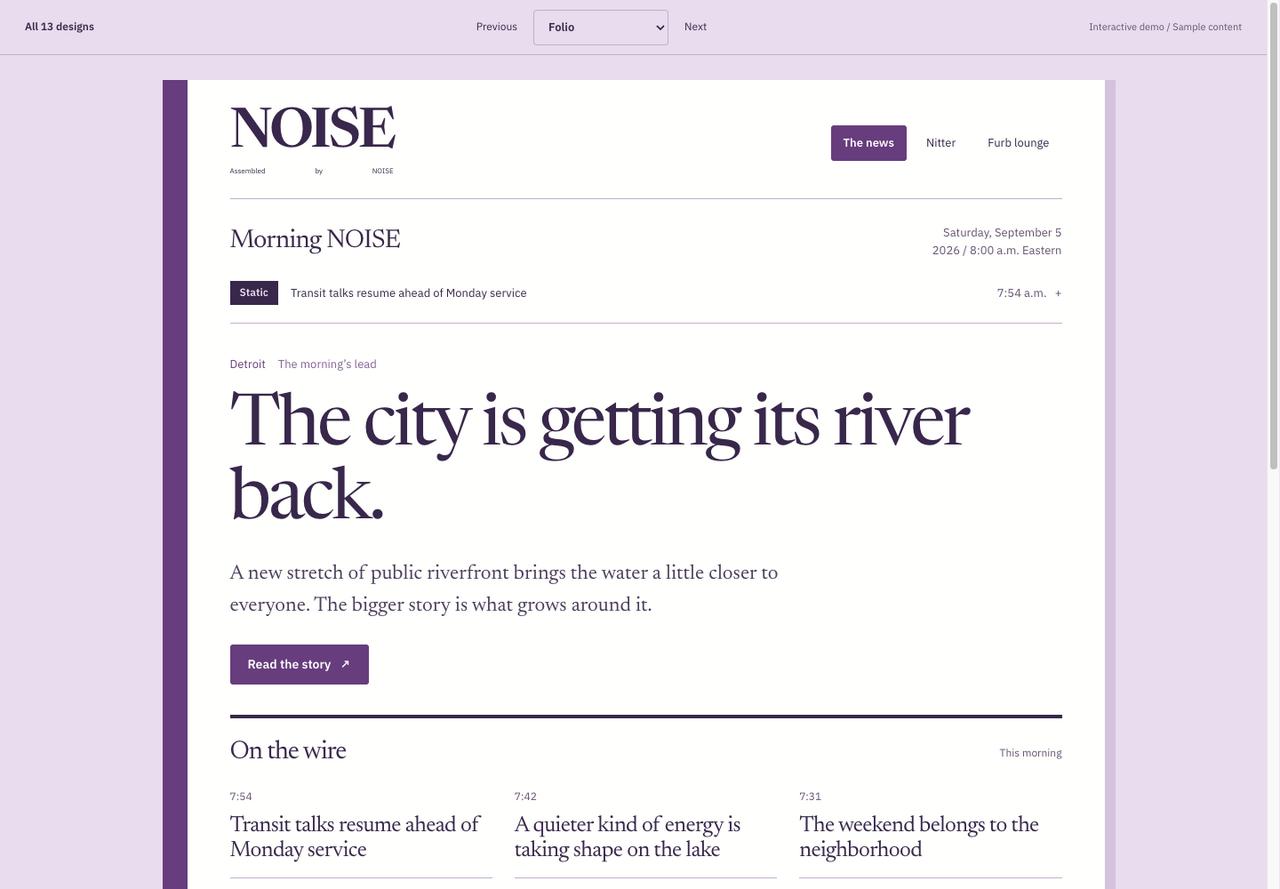
A lavender book spine, an unhurried reading column, and catalog-like records.
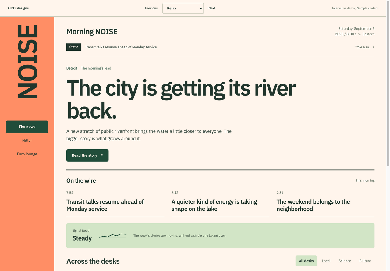
An orange station rail, a broad reading area, and a distinctive vertical wordmark.
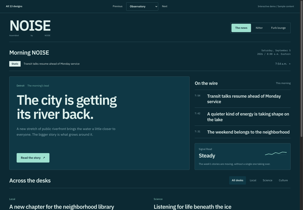
A petrol-blue instrument panel with measured details and quiet mint highlights.
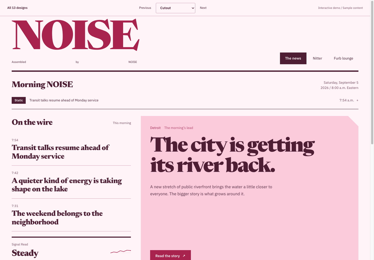
An independent magazine with raspberry ink, big serif type, and clipped paper edges.
The first round, here for comparison.
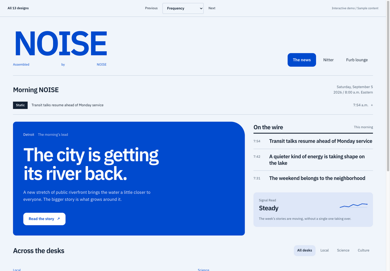
Clear blue, oversized sans type, and the rhythm of a public broadcast.
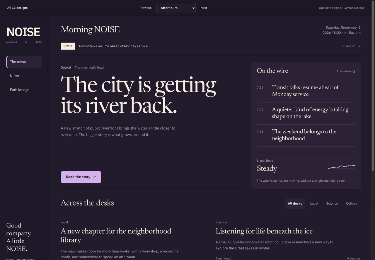
A dark editorial retreat, with a quiet side rail and warm serif type.
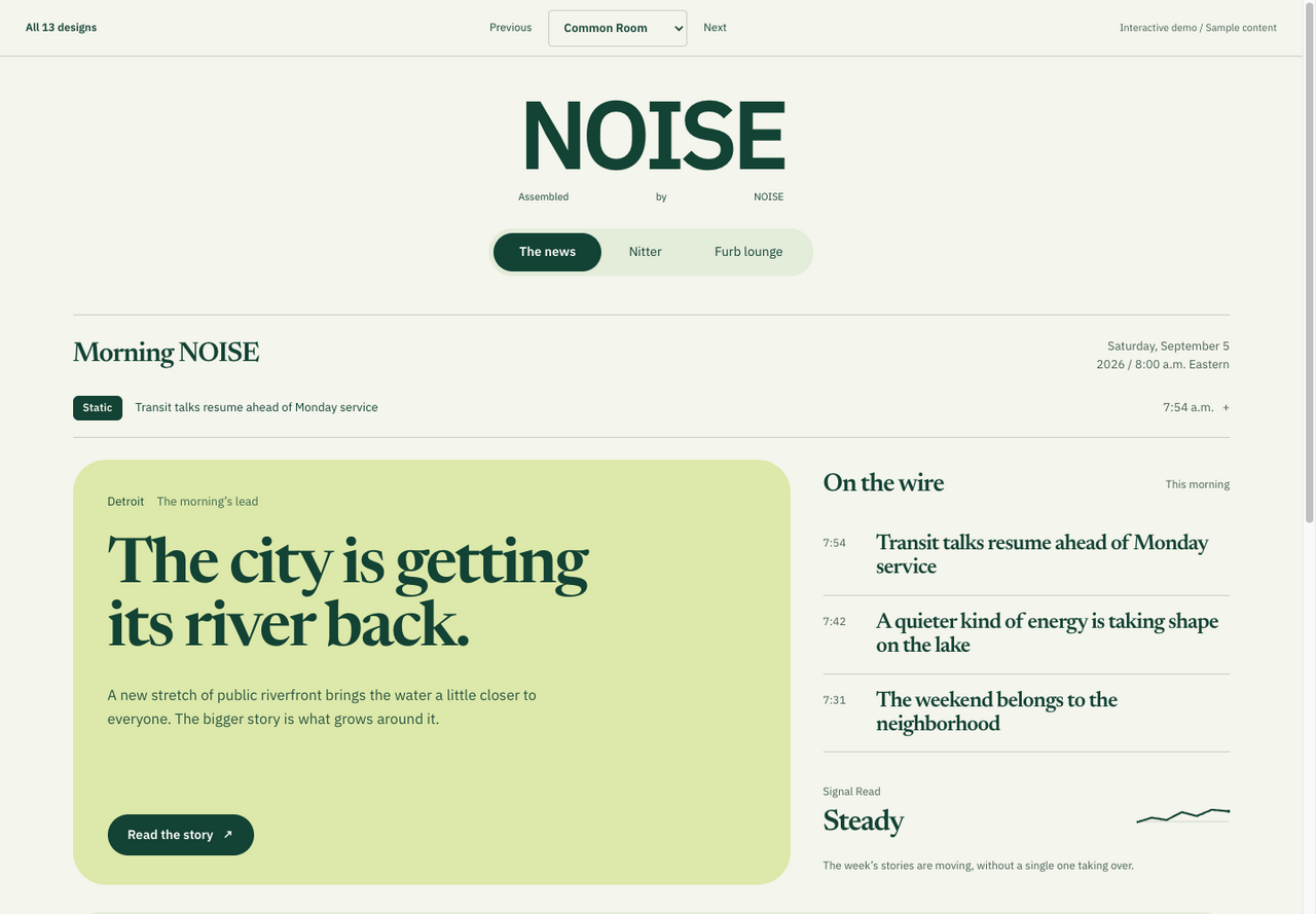
Forest green, generous curves, and an easy community-paper feeling.